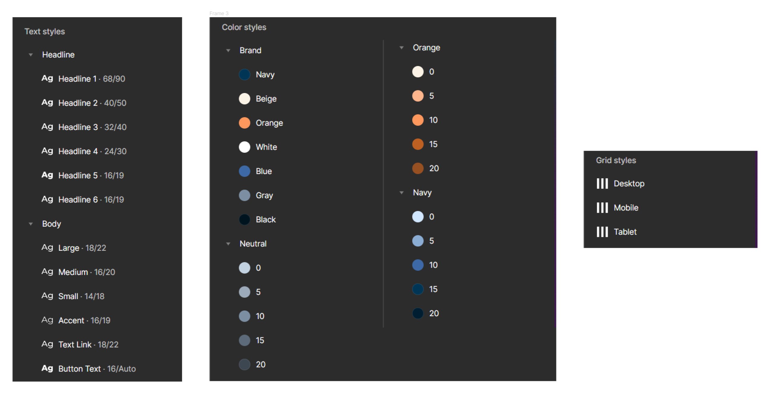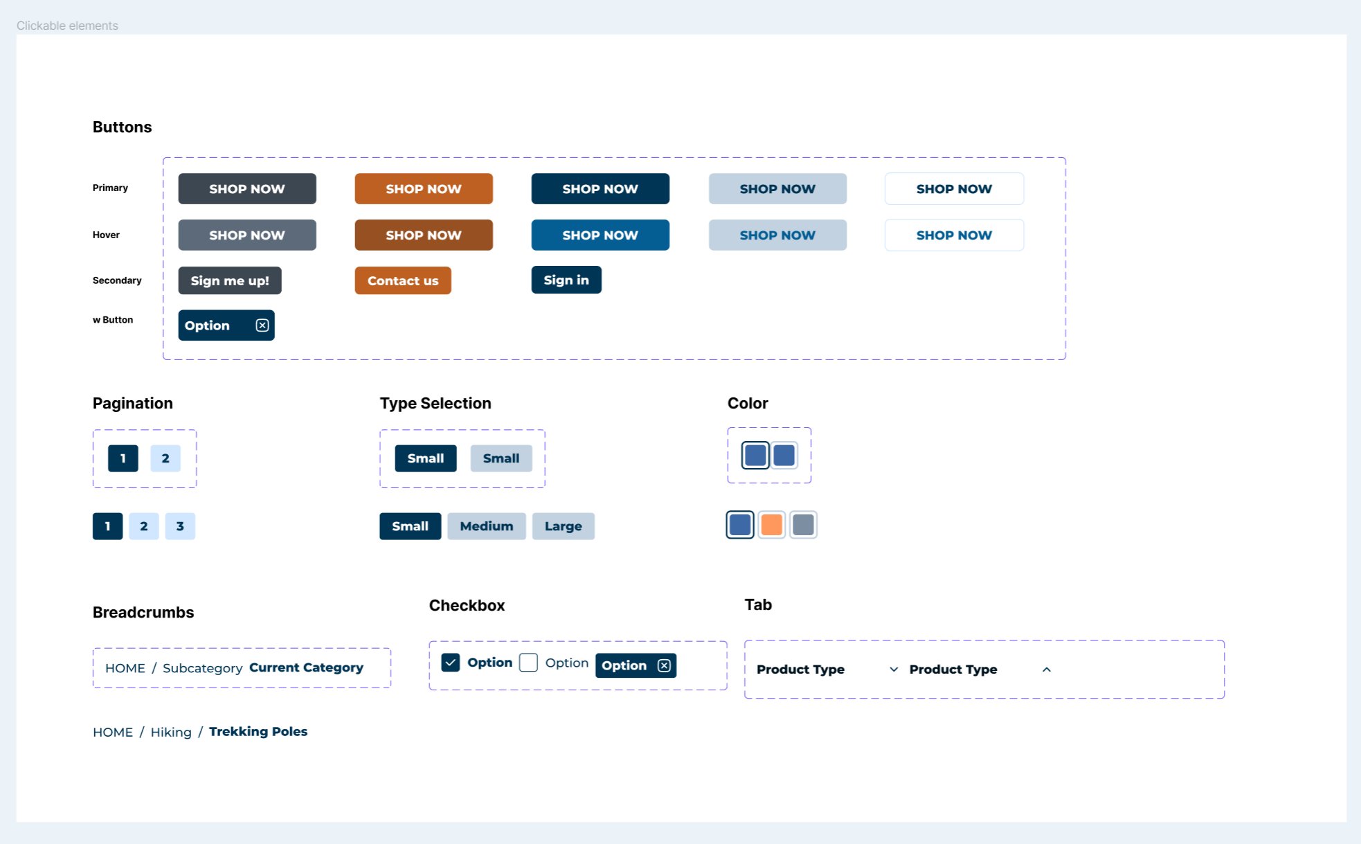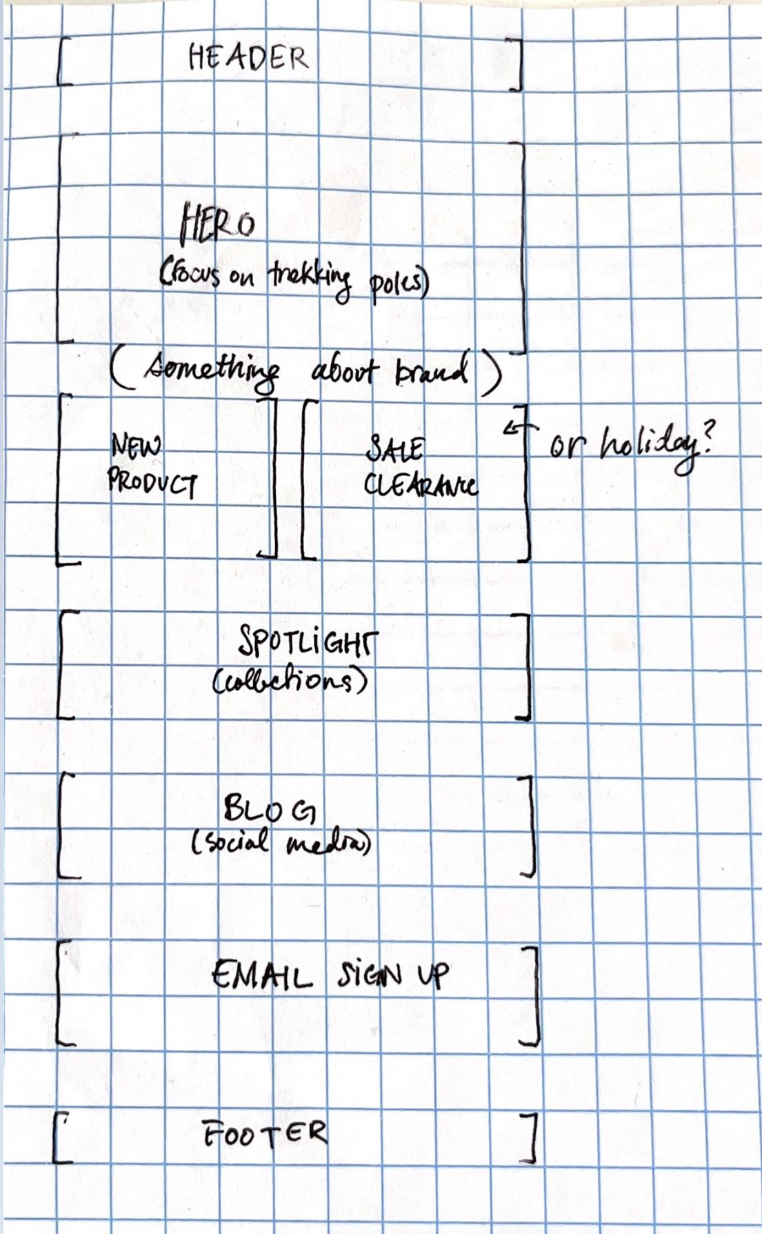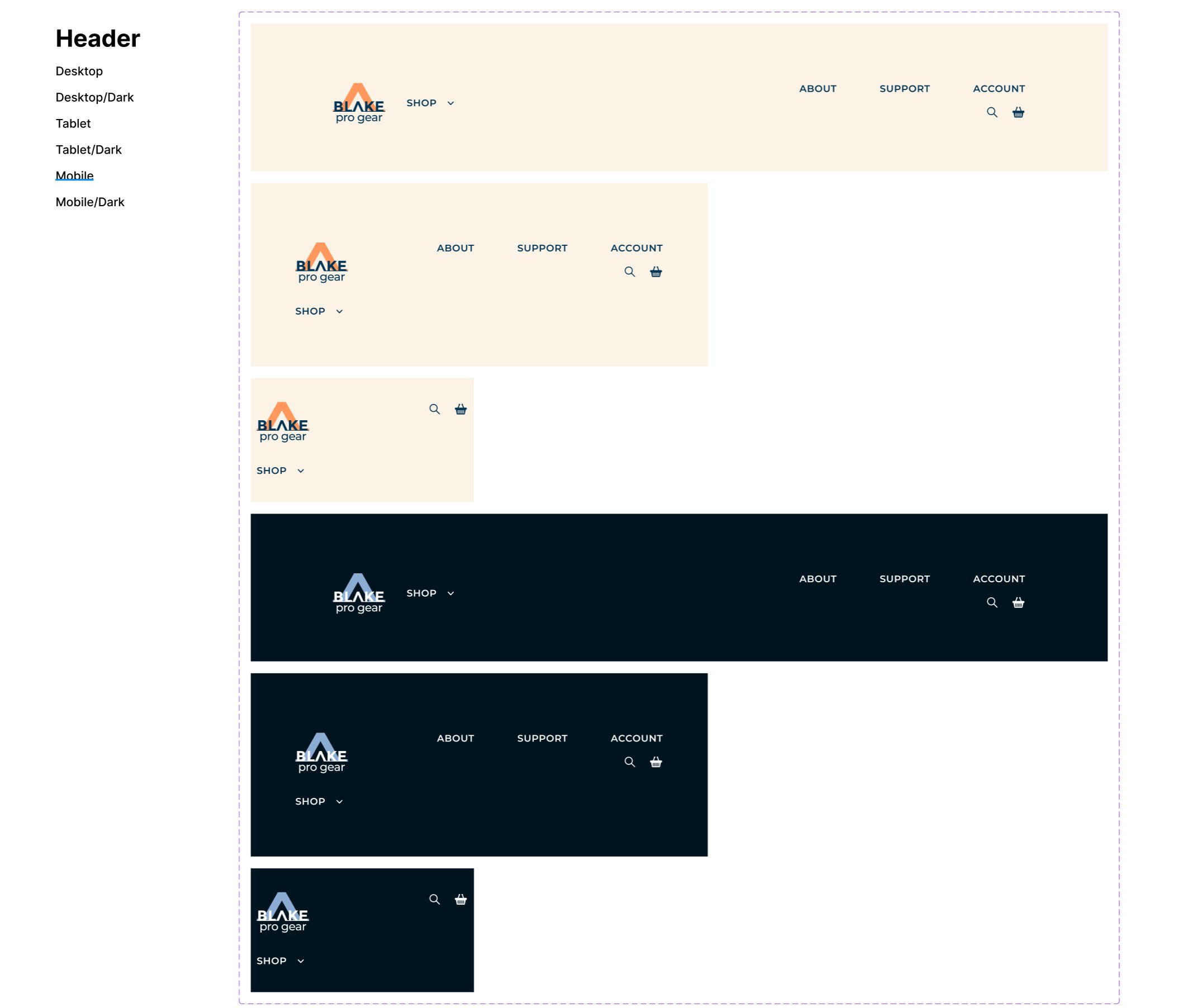
With validation from user research and persona creation, I met with the stakeholders to conduct a brand audit where we determined specificities of the brand personality and visual identity. I compiled all of these into a brand guideline presentation that could be shared with the stakeholders.
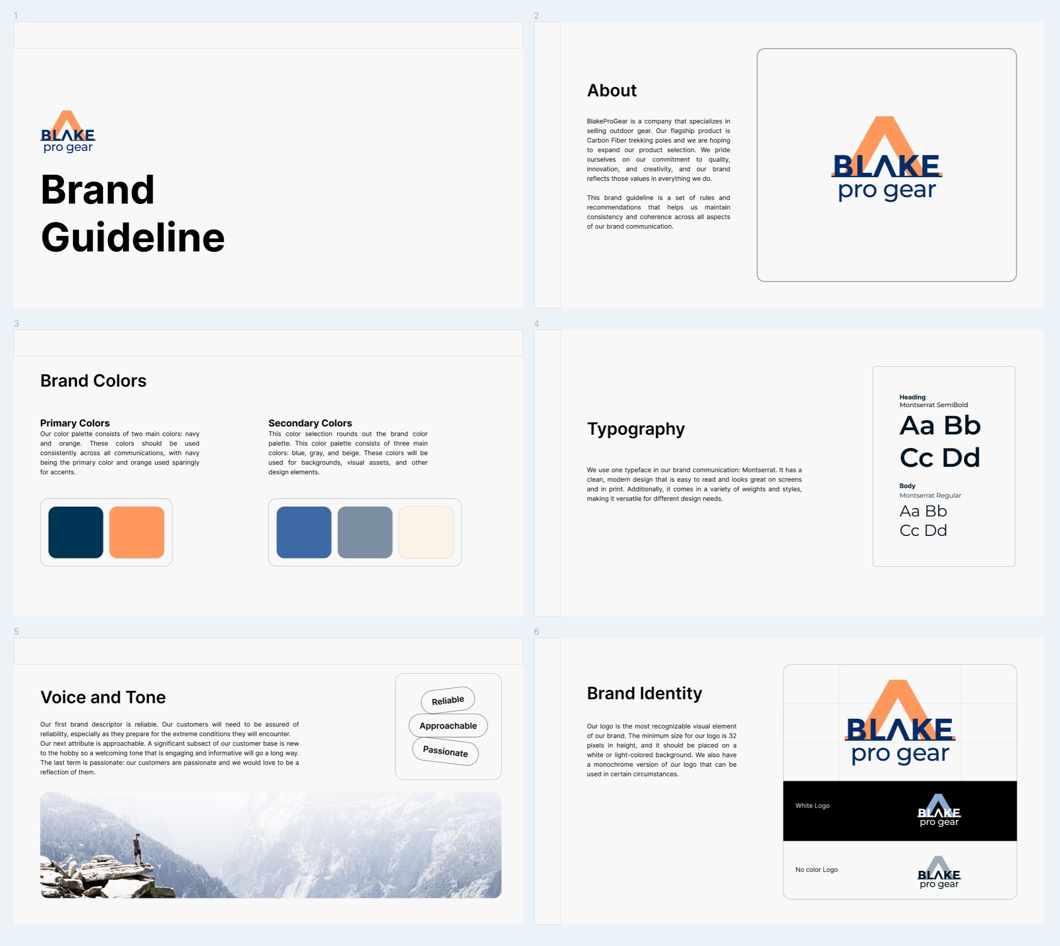
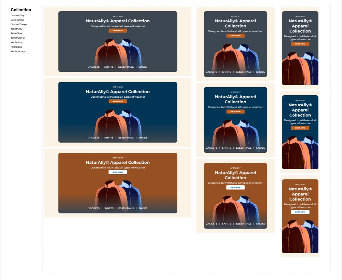
Screenshot of the resulting brand guideline. This was discussed heavily and iterated upon to ensure a satisfying result for the client.
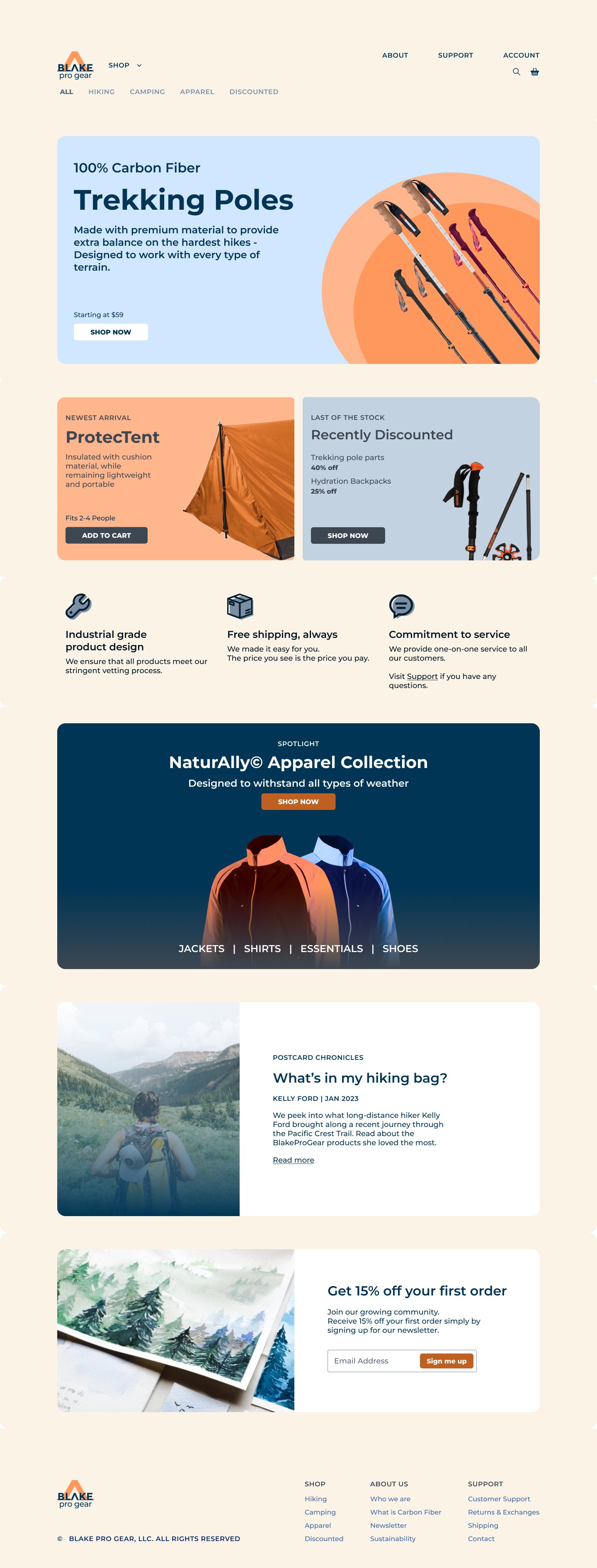
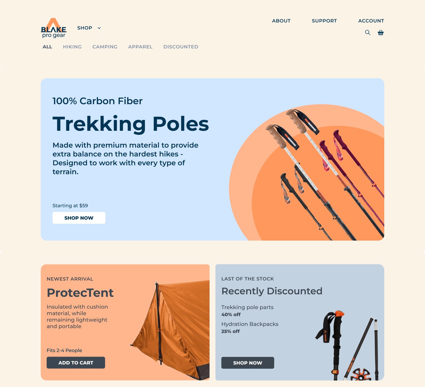
The logo served as the backbone for the rest of the visual elements on the webpage. First I took the logo and redesigned it to a form that would work for both print and web. The colors from the logo helped me create a color palette that would guide the design of the webpages.